Landing Page Best Practices
Landing Page Experience
Open All
- Ads have a “Learn More” CTA
- Additionally ad is clickable from all text boxes
- CTA and text boxes all drive to the same landing page

- Landing page has minimal areas where user can click/engage
- Some landing pages include program videos that play on the page
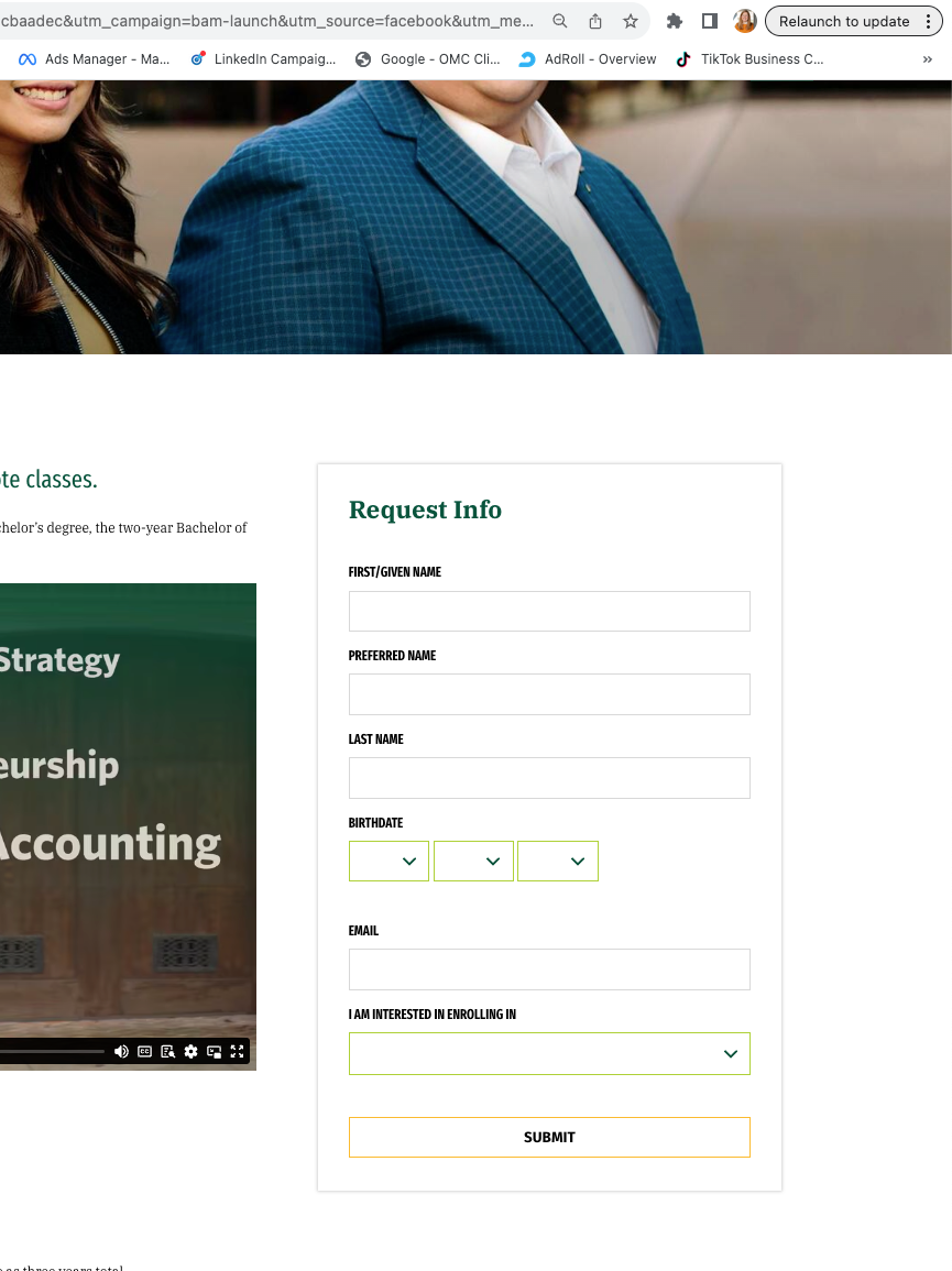
- Slate embedded form on the right offers the opportunity to collect leads
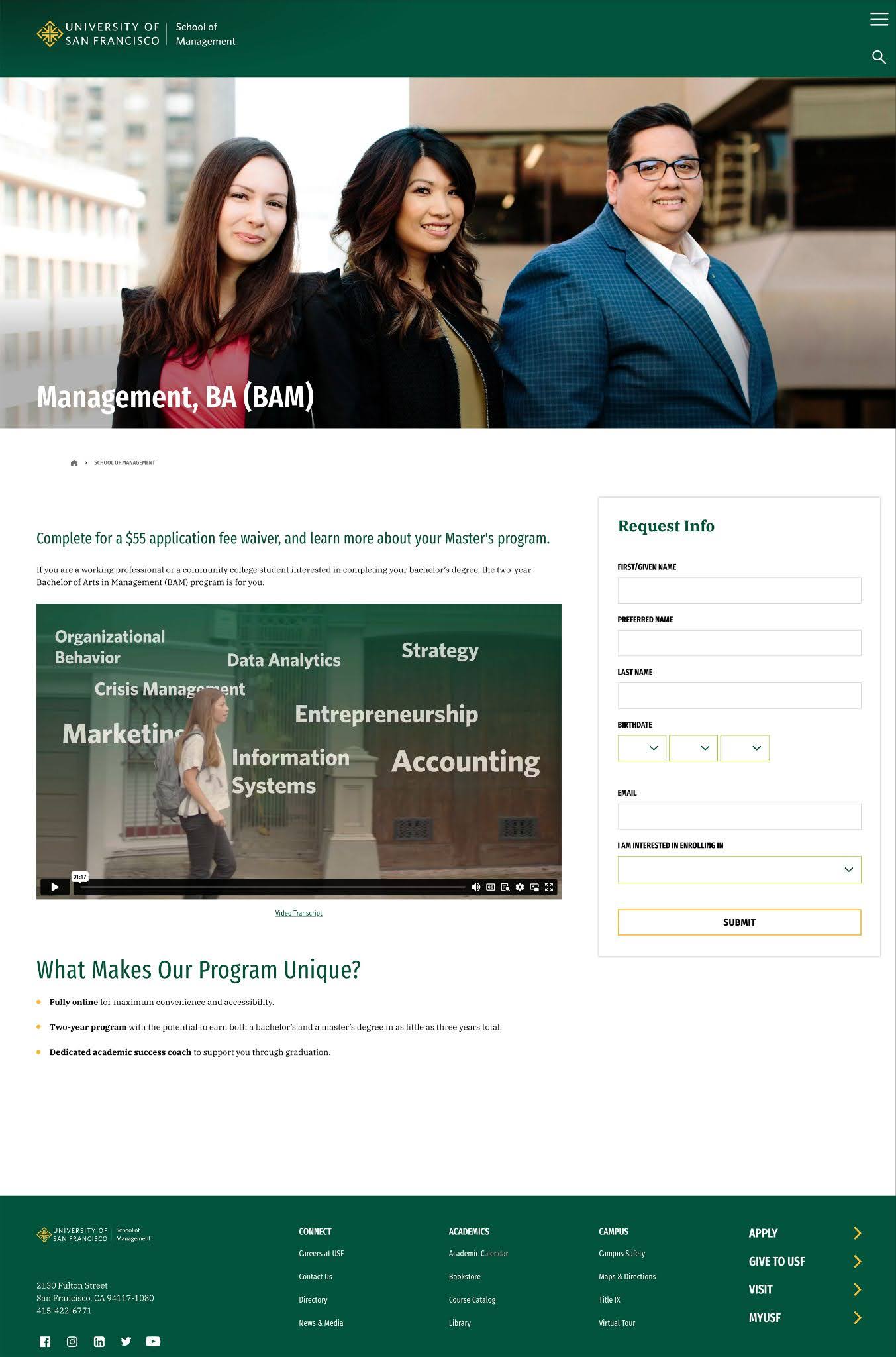
- Enables tracking and attribution to occur in both Google Analytics and Slate

Slate Embedded Form:
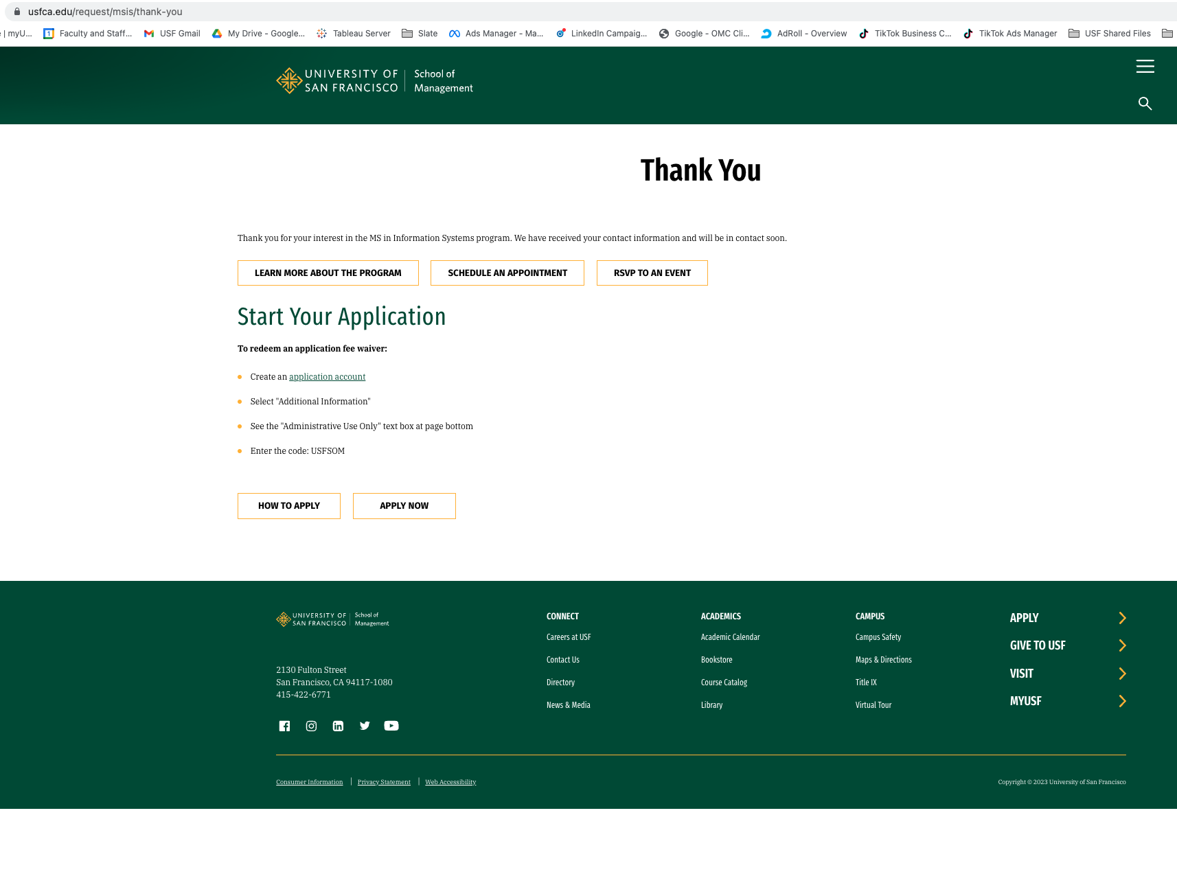
- Platforms are set up to count a “Thank You” page as a conversion
- URL must contain “thank you”
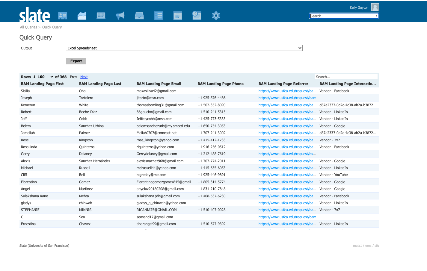
- Prospect becomes part of drip campaign
- Email marketing, event notification, phone follow-up, etc.
- Recruiters are able to assess leads from platforms in Slate
Best Practices
- Focus on one clear CTA that is positioned above the fold
- Keep Slate form simple
- Minimize links on page
- Ensure messaging matches the ad
- Include a video, hero image, or quote
- Write focused headlines
- Emphasize benefits
- Leverage social proof (e.g. testimonials, rankings)
- Easy to navigate
- Design for mobile
- Minimize load time
- Update often to keep content fresh and in line with ad copy
Criteria for Evaluating Landing Pages
Open All
- Use of high-quality videos or images on the page
- Key information placed above the fold
- With multiple visuals, are they interspersed throughout page
- Use bullets, bold/italics and spacing for visual separation
- Amount of Text – not too much
- Does copy pay out the ads?
- Does the landing page have a strong call to action?
- Are keywords included in the content? Important for Search ads.
- User-focused copy that delivers on ads
- Outcomes
- Program Benefits/Key Selling Points
- Location Benefits
- Offers/Incentives
- Social proof with testimonials, endorsements, rankings, etc.
Before and After
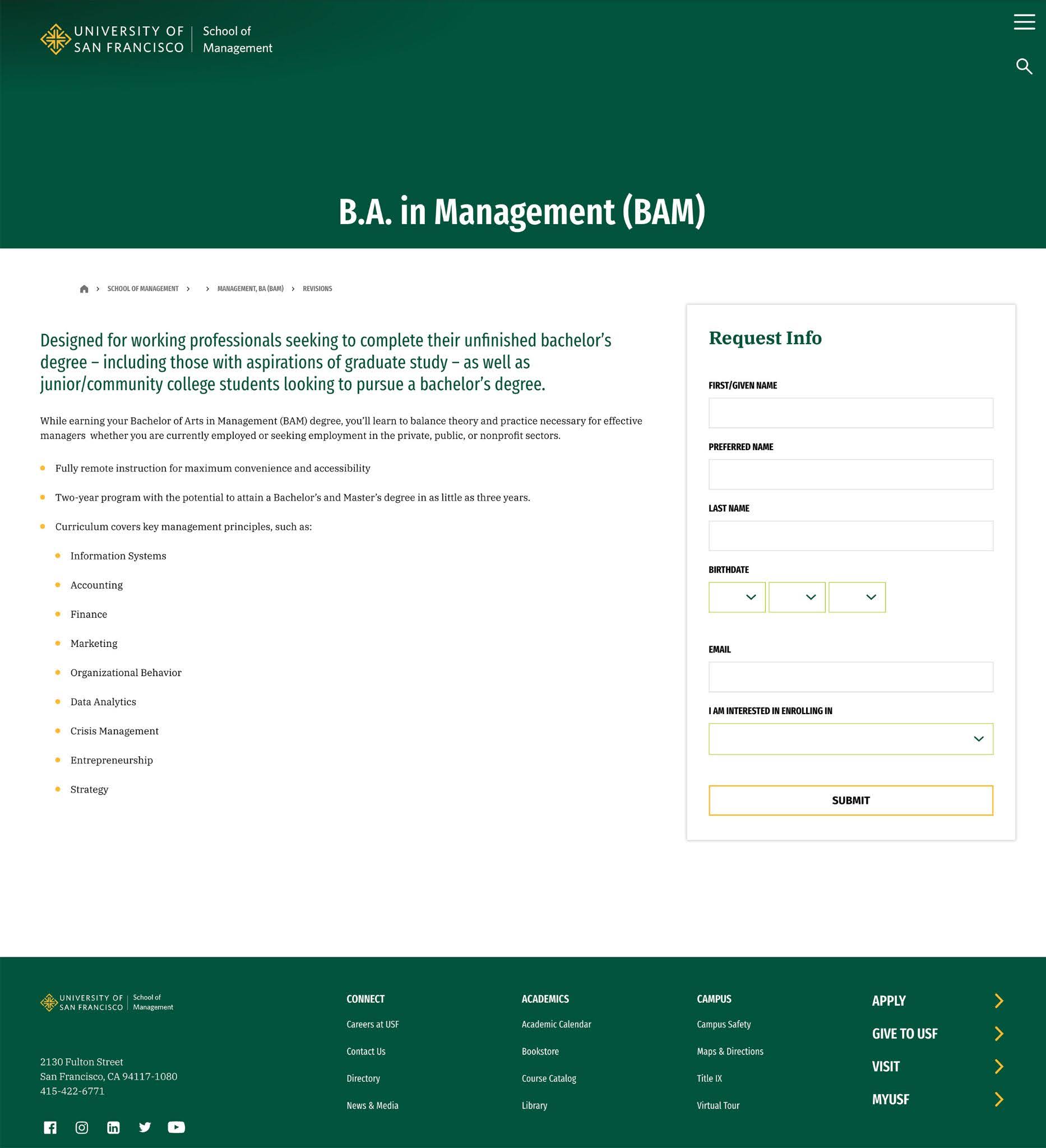
- No visual in heading
- Text-heavy
- No visual or quote in body

- Photo imagery
- Incentive highlighted
- Video imagery
- Light benefit-focused text
- Simple RFI form front and center