Example Event Layouts
Here you'll find some real world examples of different kinds of event pages. We've provided some comments on what is working well and ideas for further enhancements. Apply these ideas to your next event to make it as usable and effective as possible.
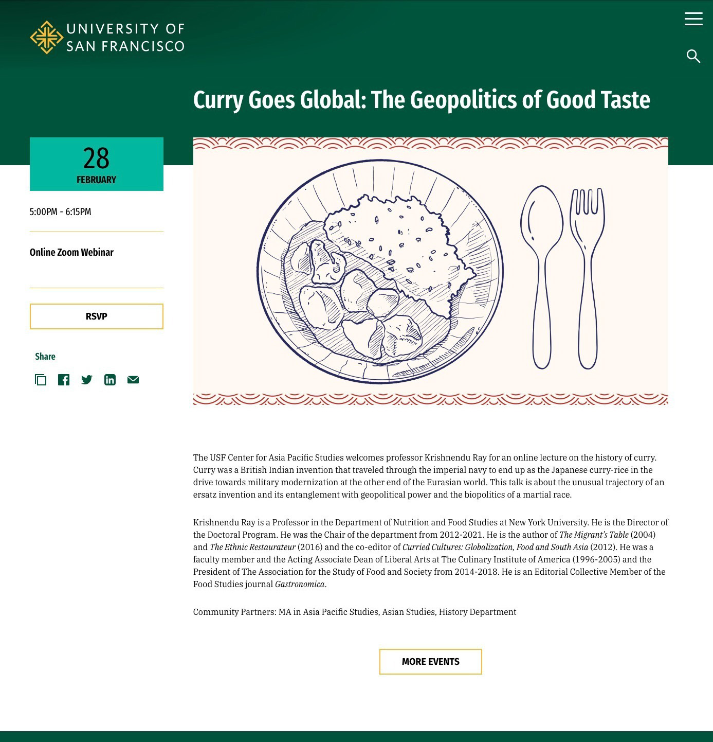
Curry Goes Global Event
- Catchy title, descriptive and intriguing
- Main image is unique and well chosen. Lack of text overlay keeps it clean and appealing
- Well written, interesting description of the event topic
- Nice mini biography of the presenter, with proper use of italic for titles
- Sponsoring partners called out
- RSVP button in left column is being used to link to registration; a single link to registration and very easy to see
Ideas to make it even better:
- Should link to the sponsor center's website in first paragraph for further exploration
- If the speaker was USF faculty, you could link their faculty bio. Not recommended to link to external sites for bio info.
- Partners for the event could be linked as well
- Partners line could be styled with alternate font choice, like "note" class which is smaller and would set that off as unique information

Use contextual menu option "Open image in new tab" to view example at full size
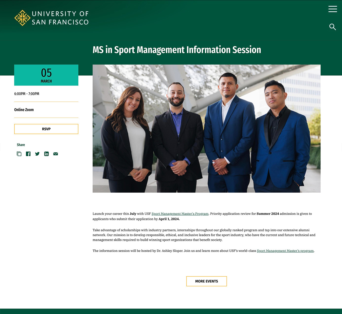
Sport Management Info Session
- Clear, straightforward title
- RSVP button is being used to link to registration
- Inline text providing clear link to the program
- Highlights in text call attention to important details
- Descriptive information is clear, marketing savvy, and states the uniqueness of our program for prospects
Ideas to make it even better:
- Image is pro but not very interesting or dynamic
- First sentence could have stood on its own to be a "hook" and formatted in intro text style or even as an H2 header
- Could link Ashley Sloper's name in third paragraph to a bio page or meet the staff page

Use contextual menu option "Open image in new tab" to view example at full size
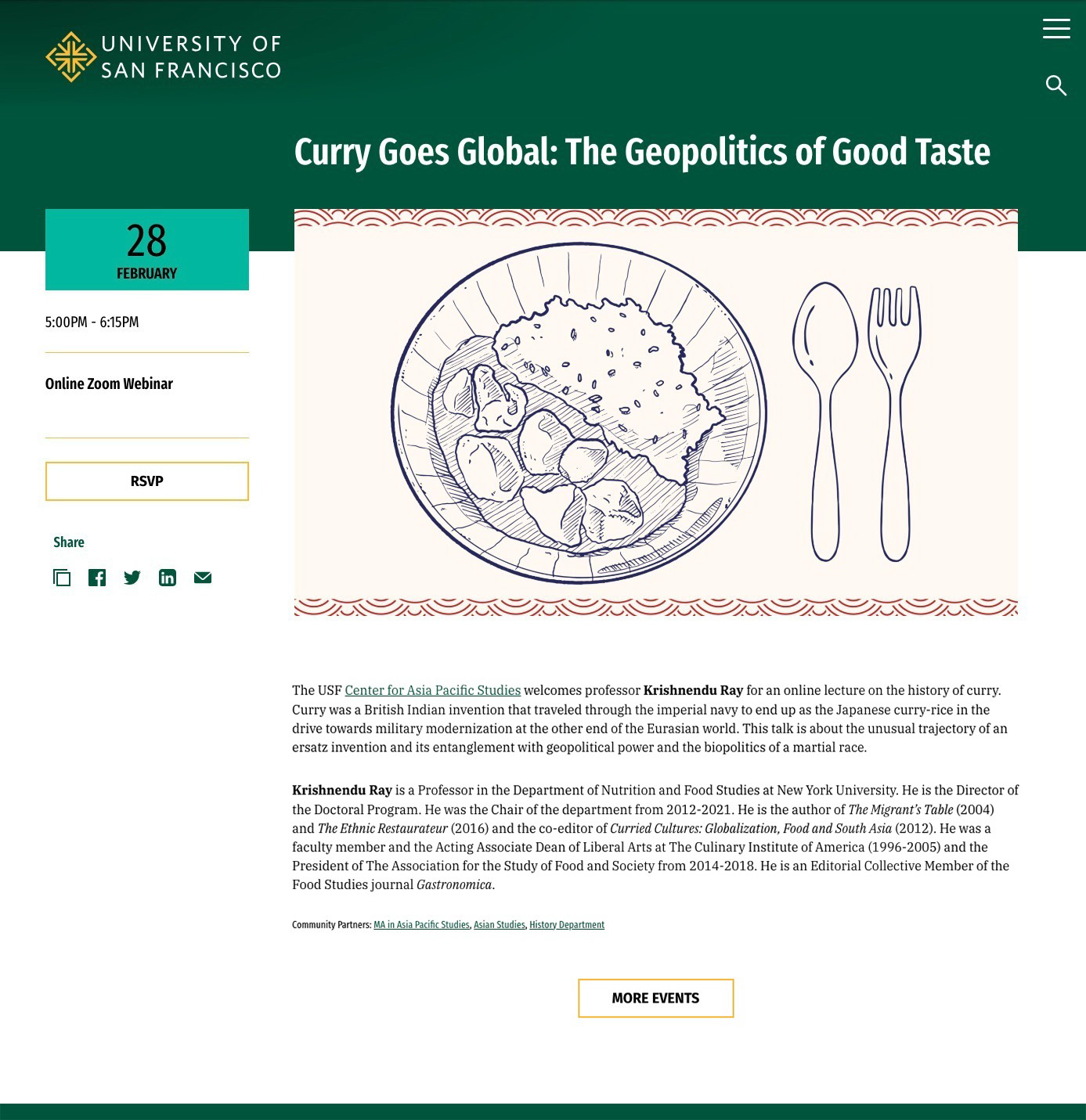
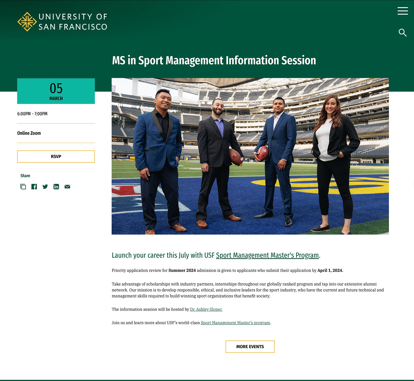
Example Events with Suggested Edits Applied

